Paul Morris is a graphic designer and writer who collects album art of the 1940’s and 1950’s. He finds his examples of influential mid-century design in the used record stores of Portland, Oregon.
In this edition, Paul explores the art of London Records
__________
The London record label was a major classical label in the 1950s and 1960s. It has undergone numerous splits and incarnations, but in this period they were the American offshoot of Decca Records in Britain. Many of the titles below were originally released in London. They were known for their high fidelity and their “ffrr” (full frequency range recording) tag.
Alex Steinweiss worked with both London and American Decca. At London his designs are less artistically ambitious than his efforts at Decca, but they achieve a nice balance of glamorous “rack appeal” and the artist’s own quirky drawings.
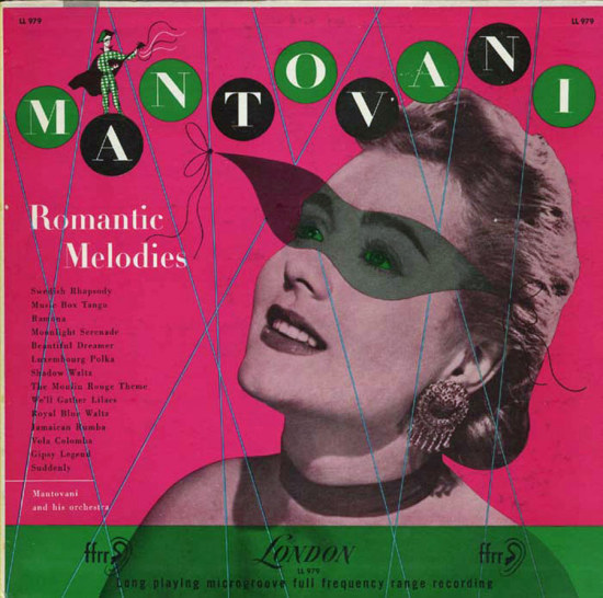
The first Mantovani (1954) is uncredited, like all the London covers, but unmistakably Steinweiss. He was fond of “tying together” elements of his design with swirling ribbons and strings with tied in bows. Both the harlequin and the model wear masks that evoke a masked ball.
__________
These albums from the same genre follow a template, using the same typefaces in the Stanley Blacks. In the first one, the Playbills are theater programs. I can’t be certain Music for Romance is by Steinweiss. The overlay of circles doesn’t work well; it reminds me of Saul Bass’s poster for Vertigo.


__________
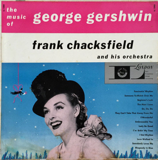
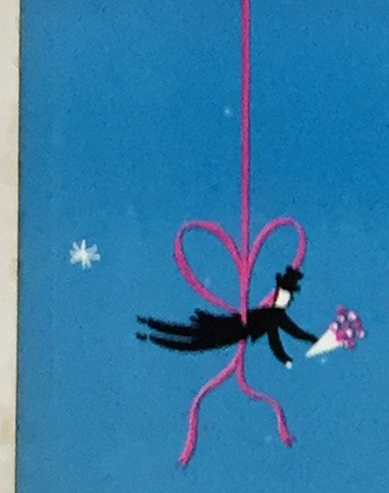
This jaunty design is from 1952, about when Steinweiss left Columbia Records. The gentleman with flowers and the ribbon bow are the tip-offs.
__________
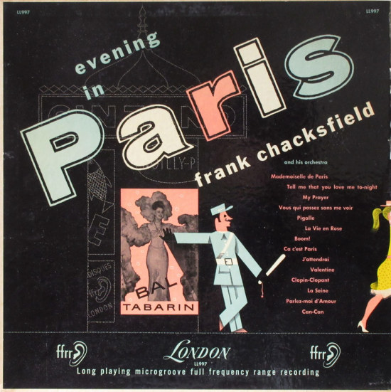
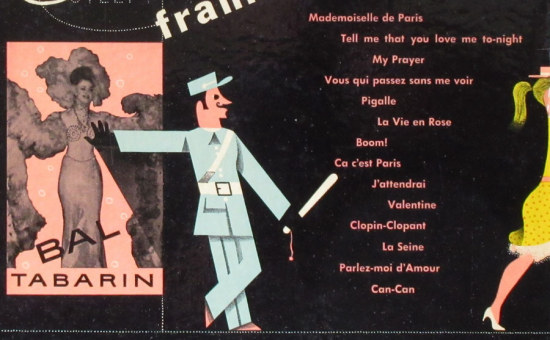
For An Evening in Paris Steinweiss shows a gendarme leaning provocatively on a poster. I found that the Bal Tabarin was a prominent Paris cabaret; the woman in the poster resembles Florence Waren, a dancer who performed there. Originally from South Africa, she hid her Jewish origins while living in occupied France, even becoming popular with German officers.
The liner notes stress how relaxing the music is, a frequent theme. This description is from an anonymous hack: “This is the sound that we hear coming from the lips of those endearing and intimate entertainers that go with this kind of music, smooth ladies and gentlemen all, who have taken the edges off music and made it into a subtle cure for nervous disorders.” Mood music as a psychiatric cure!
__________
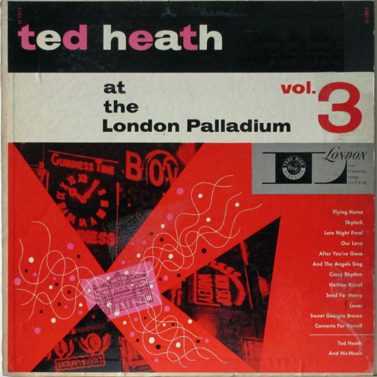
This Ted Heath cover is from 1955 and bears the Steinweiss touch. The shapes emanating from the drawing of the Palladium represent spotlights, as on an opening night.
__________
I wish I knew the designer of this Schubert cover. The background seems to be an old engraving of a sunset. There is an appealing strangeness in the way the conductor and the other elements are dropped in.

__________
This 1951 album could be by the same designer. It’s hard to know if the disembodied hands are intended to look surrealistic, but that’s the part I like.

__________
This Dvorak cover, also 1951, depicts the composer and three images, one of which is the Charles River Bridge in Prague—it’s lined with statues.

__________
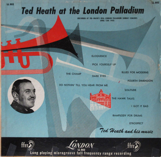
I wouldn’t have pegged this as a Steinweiss design, but the drawing of the Palladium is the same as on the Ted Heath album above. At the concert in 1953 when this was recorded, Heath played songs by Ellington, Gillespie, and Louis Bellson.
__________
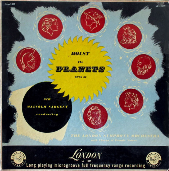
This representation of the solar system for Holst’s The Planets is notable for the liveliness and attractive colors of the illustration and the mediocrity of the type design. No credit given.
__________
Edmundo Ros was “the king of Latin American dance music in Europe.” This cover pays homage to the conga drum. The woman’s face on the “O” looks like Steinweiss. By this time, 1957, London was touting “Full Frequency Stereo Sound.”

__________
I include this Rachmaninoff cover not because of the greatness of the design, but because it has a credit: “shirle.” Nothing found about this person, and possibly the printer cut off the last letter, but these forgotten designers should be honored for their work that brought art into the record bins of America.

__________
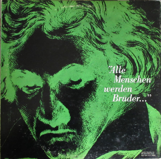
The last London record is by Steinweiss and is one of the few from this company included in books about the designer. Phase 4 Stereo featured fold-out covers and a lot of hype about high fidelity. The Beethoven cover, from 1970 at the end of Steinweiss’s career, showed him adapting to current design trends, while retaining the Bodoni typeface he had favored for decades. The second image is the back.

*
Next time…The influential mid-century designer Eric Nitsche
__________
In Volume 1 of “Cover Stories,” Paul shared his collection of covers by Alex Steinweiss, known as the father of the record album cover, and for many years in charge of Columbia Records’ art department.
Volume 2 focused on Columbia covers
Volume 3 featured jazz illustrations from the early years of the record album
Volume 4 revisited the 1950’s with images of fans holding and enjoying their albums
Volume 5 explored the work of Alex Steinweiss when he used the pseudonym “Piedra Blanca”
Volume 6 featured teenagers of the 1950’s enjoying their music
Volume 7 featured Steinweiss album covers from his prime period — the late 1940’s and early 1950’s
Volume 8 featured a “disturbing” and fascinating trend in 1950?s album art — Records on the Floor!
Volume 9 featured a selection of RCA Victor album covers from Paul’s collection
Volume 10 featured a selection of covers by Curt John Witt, the prolific illustrator for mid-century budget record labels
Volume 11 featured a selection of “glamour girl” covers
Volume 12 featured the “late Columbia” era of master designer Alex Steinweiss
Volume 13 focused on Everest Records, the last of several new labels that Alex Steinweiss helped launch
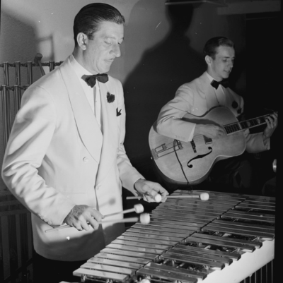
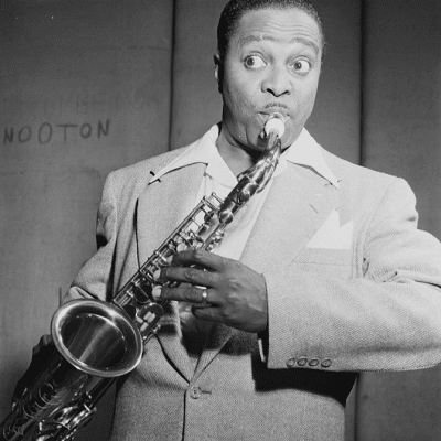
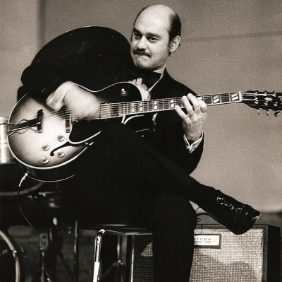
Volume 14 Paul shares some of his personal jazz record collection, concentrating on the lesser known and sometimes quirky covers that emphasize photographs















hi paul…hey thanks! only ever seen 3 of these…keep up the good/fun work! cheers! paul tescher
hi paul…hey thanks! only ever seen 3 of these…keep up the good/fun work! cheers! paul tescher
I never thought about how the art in those covers gave another dimension to the music itself! Makes it all the more interesting!
I never thought about how the art in those covers gave another dimension to the music itself! Makes it all the more interesting!
Always fascinating. Nice work, Paul
Always fascinating. Nice work, Paul